I welcome more Scars!
To be picky, I have to say that while the artwork is awesome (as usual) I don't like the pose and I don't like the repeated layout used.
I studied design and illustration for 4 years (right before I became a killing machine), so I understand the reason the artist has used such compositions and I totally agree that it's awkward having a Primarch fighting a daemon whilst also being visible and clear to the audience, but we've seen the same essential composition on the last 100 heresy novels.
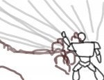
Look, I skillfully created a HH cover of my own. Look back through the artwork of all the Heresy novels and you can see that this basic template is used on most of the covers.
Sure, it works, but as someone who is just as interested in the cover art as the story, it's getting a bit dull. A single Primarch/SM positioned to the right of frame, shit happening behind.
While I do not dispute the skill of the artist (it's awesome) the compositions could be a little more, well, varied.
Interestingly, the initial HH novels didn't suffer from this issue. They were pictures of the greater battle and not just the main character standing in the right of the frame.
Mild complaint over.